Organization Visual
Explore the hierarchical structure of an organization.
Note:
-
To enable this feature, contact Visier Technical Support.
- The Organization visual can only be viewed as a Supervisory Hierarchy.
- Individuals on the same departmental level appear in alphabetical order.
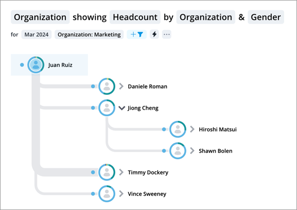
The Organization visual is a hierarchical diagram that illustrates the structure of an organization and the relationships and relative ranks of its employees and departments.

This visual is useful because it allows you to zoom out and take a comprehensive view of a complete organization, explore the chain of command within it, and use metrics to evaluate the organization on a granular level.
The thickness of each line between individuals is proportional to the size of the metric value that exists between them. The thicker the line, the greater the value. For example, when exploring headcount, the line thickness is proportional to the number of employees in total who exist below this employee in the hierarchical structure of the organization.
How to explore the visual to gain insight
- Quickly find employees in the organization by clicking the Find on chart button
 on the Visual Actions menu.
 -
Add a grouping and view key data for contributing employees. For example, grouping the Headcount for the Supervisory Hierarchy by Risk of Exit will show a breakdown of employees at risk of leaving and group the data by employees' respective managers. This data, and the colors representing the values, will be displayed in the Info panel as well as when you hover over an employee (in the border surrounding the employee photo/metric value). Employees are color coded based on their group attribute.
- Hover over an employee to view additional details on that employee as well as their subordinates (that is, each member of the organization who exists below this employee in the hierarchical structure of their department). This data will only appear if a grouping has been applied. For example, if you group Headcount by Gender, you will see the following:
- The attribute value for the chosen employee (for example, Gender: Man).
- The metric value for the employee's subordinates (for example, Headcount: 300).
- The grouping attributes and metric values for the employee's subordinates (for example, Woman: 132; Man: 128; Unknown: 40).
- Click the Expand/Collapse arrow
 next to an employee's name to navigate the hierarchy and show the employees who exist below them in the organization.
 - View detailed metric data and employee data associated with an individual in the Insights tab of the Info panel. Click the Employee details section to expand and see the attributes of the selected employee. From this view, you can also click the employee's job name to launch the Potential Career Path visual to navigate the various jobs the employee can have as they progress within your organization.
- Click View Details with an employee selected to view in-depth data on the individuals reporting to the selected employee.
- Isolate the data for one employee and their subordinates by clicking Drill Down in the Info panel with an employee selected.
- Toggle display settings by clicking the Settings button
 and choosing either Show employee photo or Show metric value.
Tip: Right-click on a chart item or data point to open the Visual Item Actions menu. Find actions that will allow you to quickly interact with points of interest. Actions include drilling up or down to view different levels of your data and accessing the Detailed View visual to see a list of subject members or event occurrences that make up a given population.
